2022.08 ~ 2022.09
Me, Shimin Chen (My mentor), Engineer
Focus Group, Usability Testing, User Interviews, Information Architecture, User Flow, UI Design, Prototype
Professionally trained Resident Care Attendants assist the disabled and older adults at home.


Notification Center include four modules: Home Care Services Report, Application Center, Verification Management, and Smart Scheduling.
In this project, I need to modify and optimize the Application Center into Home Cards.

I conducted interviews with some company's internal personnel on the functions of current Home Care System.
Applications are urgent to be verified, but they tend to be mixed with other notifications, such as verification management, home service reports, smart scheduling, etc.
Users need to enter Application Center or the notification from Notification Center, and then click the link inside the notification to verify the application, which both take more steps to complete verification.


Resident Care Supervisors hope to quickly view the shift schedule and leave applications in recent days on the Home page for verifying them, as well as quickly get the replied notifications of the shift assignments so as to reassigned the shift.


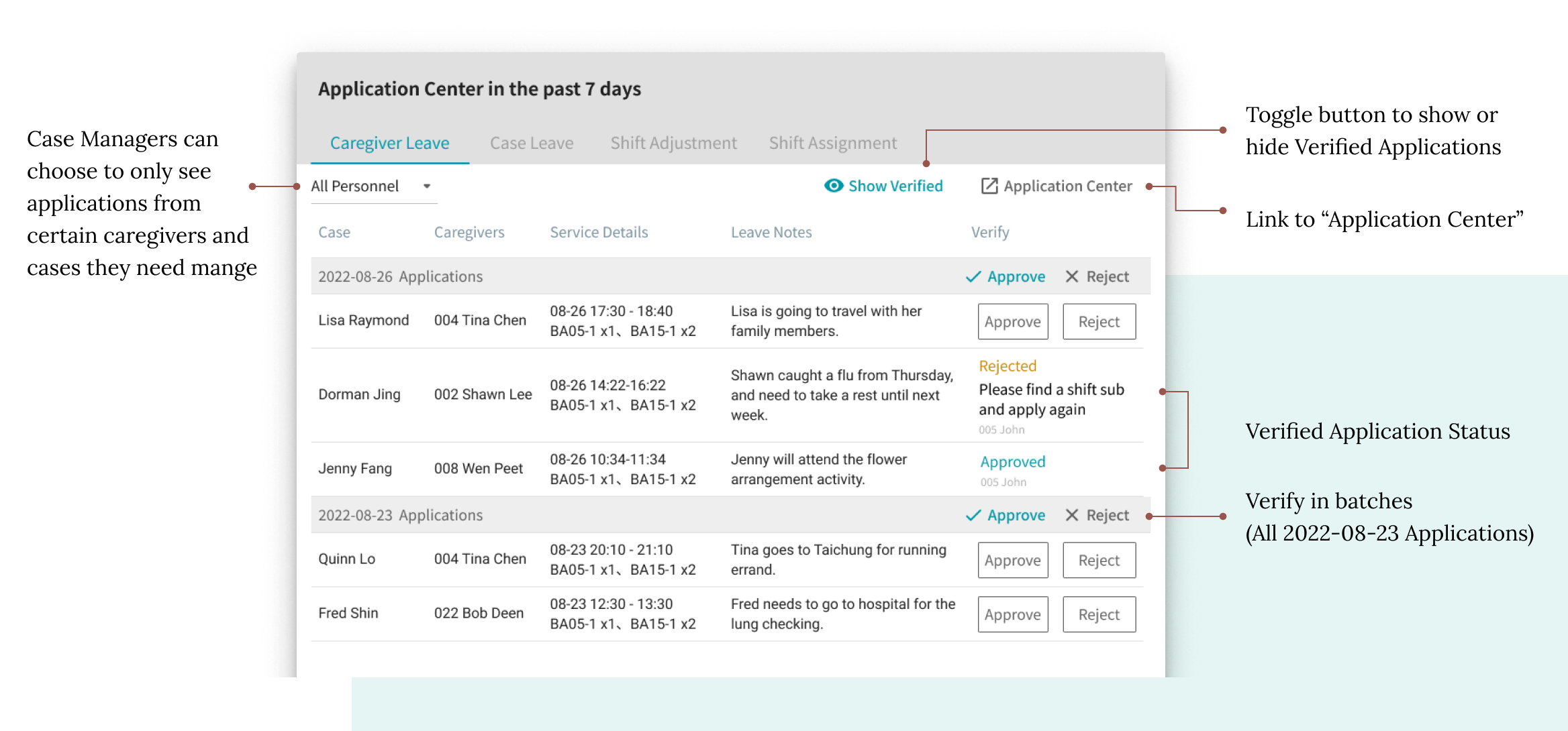
Users can view and verify applications and replies from the Home Card for Application Center within the past 7 days, which includes the current day.

Three charts display quantities of pending applications and shift assignment replies that need to be verified and viewed in different ways.


Following user's expectations for the information structure and presentation method in the interviews, I designed Home Card Dialog of the four modules: Case Leave, Attendant Leave, Shift Adjustment, and Shift Assignment. Two different UI of forms in dialogs are based on information processing flow


